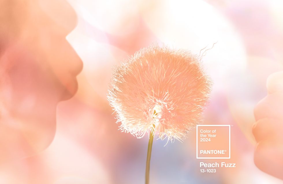
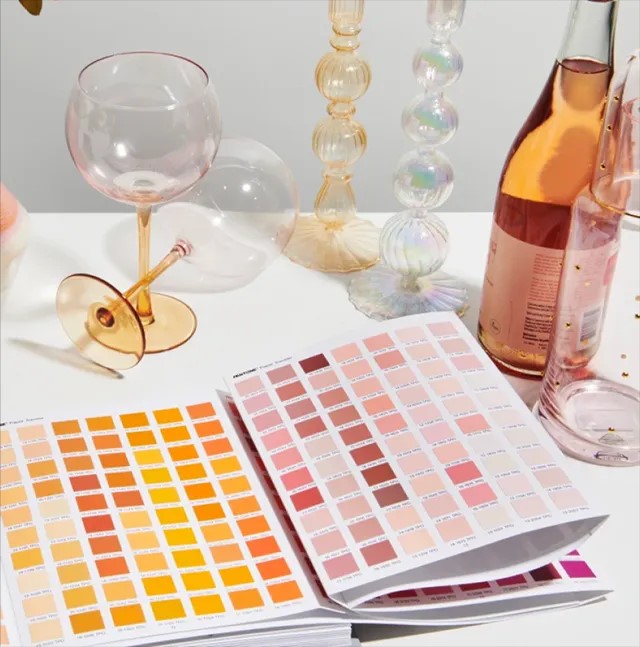
If ever there was a colour to give you a warm cosy feeling, it’s Pantone’s 2024 color of the year – Peach Fuzz. Described as ‘a velvety gentle peach tone whose all-embracing spirit enriches mind, body, and soul’; Peach Fuzz (Pantone 13-1023) highlights our need for being with others or for enjoying a moment of stillness and the overall feeling that this brings. Announced on the 7th December 2023, by the Pantone Color Institute; who are best known for their colour matching system, this glorious soft colour is nestled somewhere between pink and orange. But just what is the meaning behind it and how can you reflect it in the interior design of your home?
January is the start of new beginnings and looking ahead, whilst also reflecting back on the previous year, and for interior designers and the fashion world, it’s the time of year when they look at the Pantone shade of the year and see how they can use it in their designs. 2024 is also the 25th anniversary of the ‘Pantone Color of the year’ and previous years have brought us Viva Magenta (2023), Veri Peri (2022), Pebble grey and hazard-warning yellow (2021 joint winner) and a muted evening blue in 2020. All very different shades and stunning In their own way, and we are excited to see just how Peach Fuzz can be incorporated into our client designs in 2024.
Peach Fuzz has evolved from last year’s Color of the Year for 2023 – Viva Magenta, and Pantone believes that over the past few years, we have realised the importance of enjoying more time with people and places that we love. The colour brings a sense of security and ease and reflects our craving for the past and trying to have a simpler less hectic life, whilst savouring where we are now, and having hope for peace for the year ahead.
“We selected the name very thoughtfully because it’s the tactile aspect of the color that’s so very important as well as the vision of the color,” explains Leatrice Eiseman, executive director of the Pantone Color Institute. “It showcases our ‘want to be close to those we love’ and the joy we get when allowing ourselves to tune into who we are and savour that moment of quiet time.”
How can I use Peach Fuzz in my home?
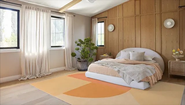
Peach Fuzz radiates warmth and is therefore, perfect for creating a warm glow in your home. It can be used to paint a wall, in your general home décor, or used as an accent colour within a pattern on curtains, carpets or accessories. The colour has a retro feel, but also works in a traditional-style interior when you want to mix old and new pieces in your home. Peach Fuzz would look great as a pop of colour in a piece of artwork or as a subtle complementary colour in fabrics like throws, pillows or bedding. Or used in the form of a knitted blanket or a faux fur rug, Peach Fuzz can give a sense of security and ease.
Which other colours are on trend for 2024?
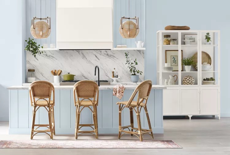
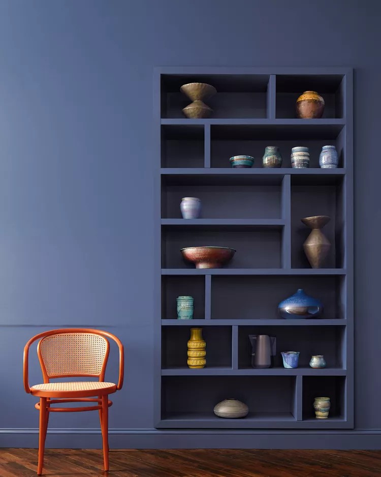
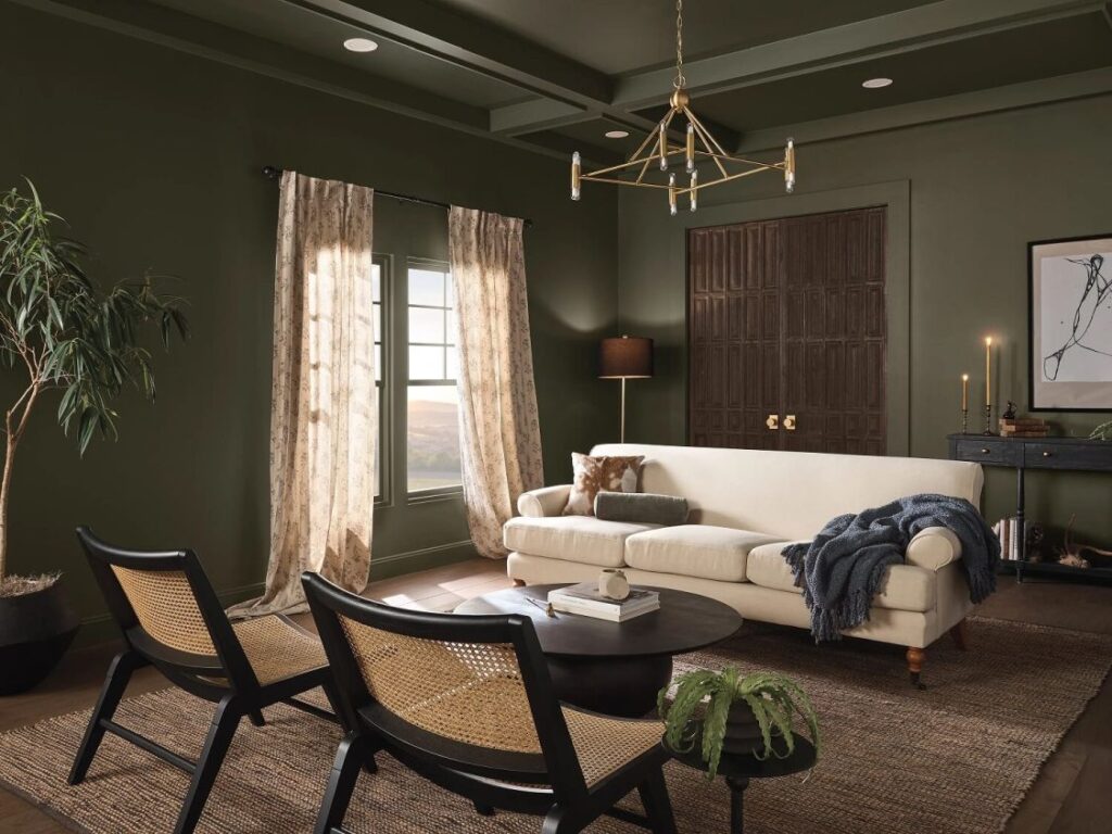
If Peach Fuzz is not the colour for you or your home, there are plenty of other options to consider. Earthy, nature-inspired tones of terracotta and rich deep greens are forecast to be big trends this year, along with coastal-inspired blues – from light pastels to bold teals. Here we have chosen a few of our favourites to share with you:-
Blue Nova by Benjamin Moore – a rich, grounded blue that represents the blend of modern and traditional styles that are popular in home interiors right now. Blue Nova 825 is an alluring mid-tone that balances depth and intrigue with classic appeal and reassurance.
Cracked Pepper by Behr – this is a deep almost-black charcoal hue that adds sophistication to any space bringing a sense of confidence and individuality. It is neutral enough to adapt to any design style, from mid-century modern to rustic farmhouse and can be paired with plush furniture and a soft shag rug for a cozy gathering space, or used with metallic accents and exposed architectural elements for an industrial look.
Upward by Sherwin-Williams – a bright and breezy blue that was designed to infuse peacefulness into any space and brings to life that carefree, sunny day energy. You can use this shade of blue like a neutral on walls or ceilings, or on an accent wall without overwhelming the space.
Bluebird by Krylon – this is designed to be an uplifting colour that sparks joy in your home and combines the popularity of pale, pastel hues with a bold, bright tone. Its soft, yet sophisticated tone can be used to give dated furniture pieces an instant facelift, or with a quick coat of paint can bring new life to outdoor accent pieces. Wherever you use it, the bright but not-too-bold tone will instantly liven up your space.
Ironside by Dutch Boy – this deep olive shade is perfect for cosy lounge spaces like bedrooms, dens, and living rooms and helps bring harmony into your home, embracing relaxation, and helping you live in the moment.
However, you feel you want to use Peach Fuzz or one of the other colours in your home, don’t be scared as interior design is all about experimenting and being brave with your design choices. If you need any help or advice on using Peach Fuzz in your home or would like Alle Interiors to redesign a room in your home or the overall style and feel of your home interior, please do get in touch. Also please check out www.alle-interiors.co.uk to view our products and collections and the services we offer.
Notes: –
Alle Interiors is a small creative team providing a one-stop-shop for all your interior design and soft furnishing requirements with customer service their utmost priority.
Image credits: Ruggable; Pantone; Benjamin Moore; Behr; Krylon; Dutch Boy; Nordroom
Suite VT80, iCentre, Howard Way, Newport Pagnell MK16 9PY
Tel: +44 (0)1908 299 358
Mob: 07712 150 721
Email: alle@alle-interiors.co.uk
