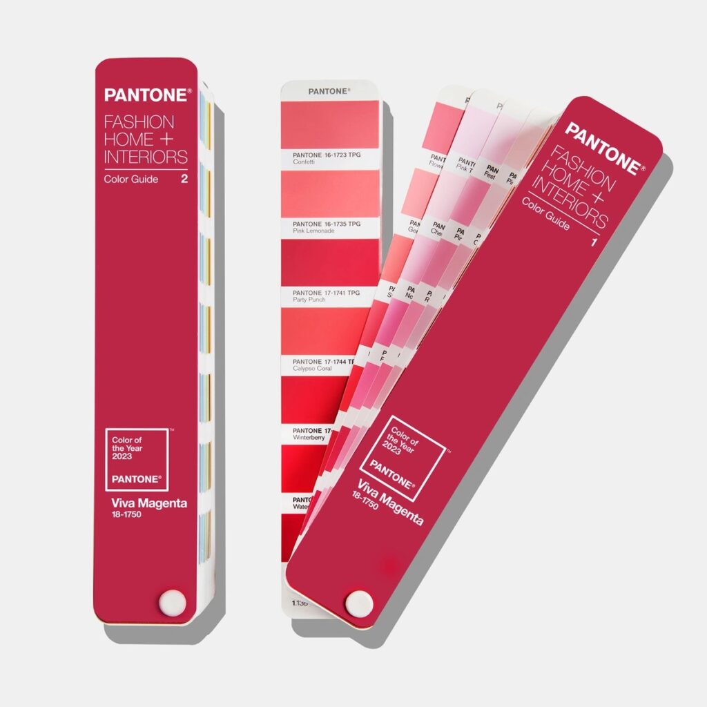
It might be a dreary January outside, but this year’s Pantone colour of the year for 2023 is sure to bring a pop of colour to your day! Described as ‘an unconventional shade for an unconventional time’, Viva Magenta is a vibrant colour that exists between blue and red, warm and cool and can be found on a spectrum of its own. Named on 1 December, 2022 by the Pantone Colour Institute; it descends from the red family, but just what is the meaning behind it and how can you reflect it in the interior design of your home?
The start of the year is a time to reflect on the previous year and look to the year ahead, so essentially it stands for new beginnings. It’s also when interior designers look forward to finding out which Pantone shade has been chosen for the new year and Viva Magenta 18-1750 is certainly a bold choice. Previously, in 2020 we saw a muted evening blue, 2021 brought a joint winner with pebble grey and hazard-warning yellow, and in 2022 fashion and home designers enjoyed working with Veri Peri, a bright periwinkle hue. Therefore, it is exciting to see how this new energetic shade will be used in both the fashion and interior design worlds this year.
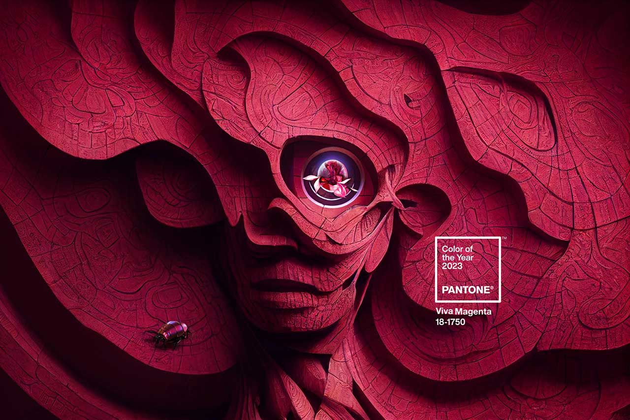
Leatrice Eiseman, the Executive Director of the Pantone Colour Institute, describes the choice as “In this age of technology, we look to draw inspiration from nature and what is real. Pantone 18-1750 Viva Magenta is inspired by the red of cochineal, one of the most precious dyes belonging to the natural dye family as well as one of the strongest and brightest the world has known.”
For those of you that are not familiar with this term, a red cochineal is a tiny 0.2-inch beetle which is found in the Armenian Highlands. Whilst it has survived for thousands of years, it has blended in with the outside world thanks to its bright-red shell; whilst other species have become extinct.
‘Viva Magenta represents reassurance, confidence and connection in a world trying to get back on its feet’, according to Laurie Pressman, the Vice President of the Pantone Color Institute. Survival is very much a common trait for us all at the moment, with the on-going covid pandemic and now the economic uncertainty of the cost-of-living crisis. So, this choice reflects on the current world climate and the moods of people around the world.
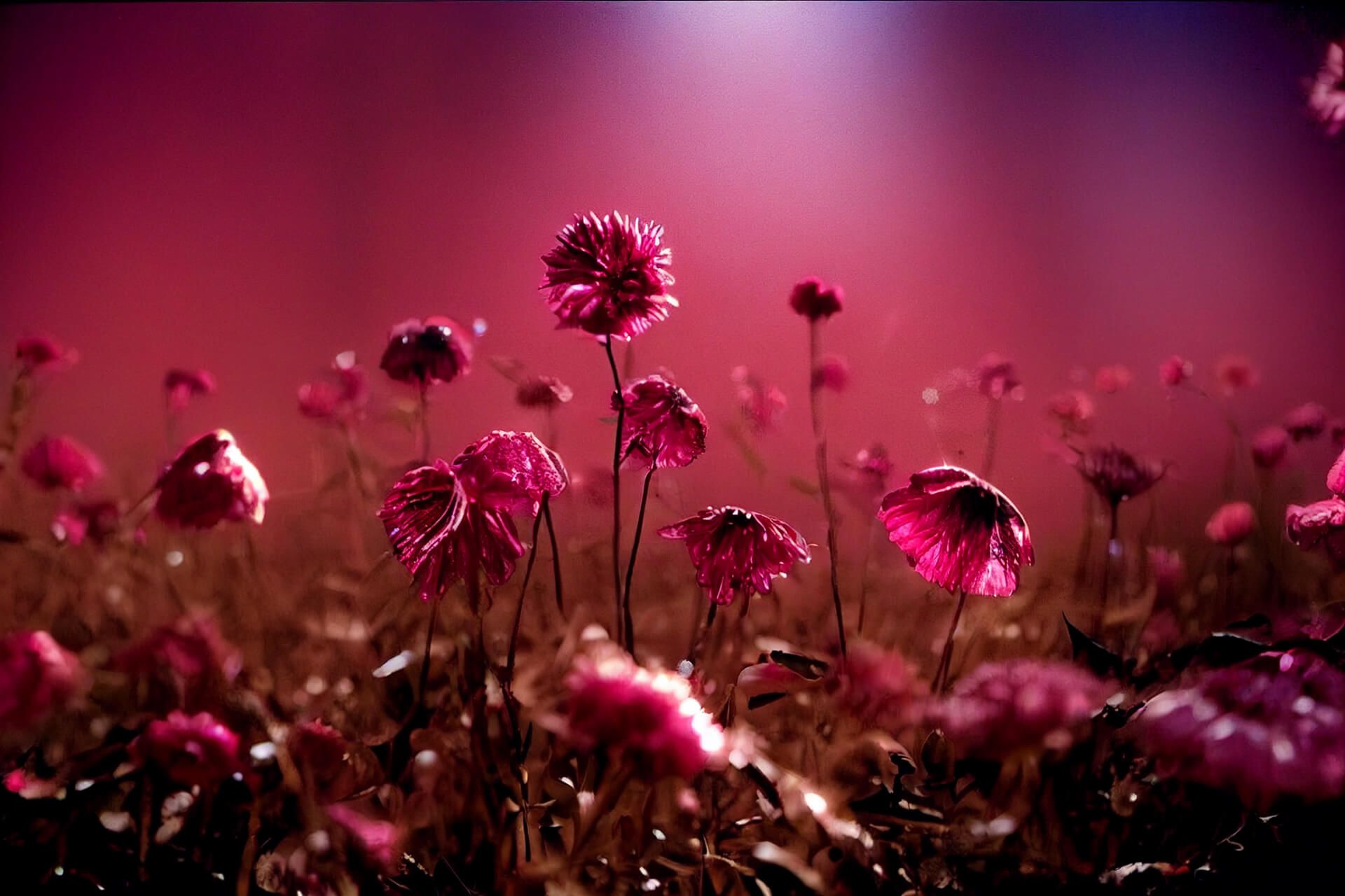
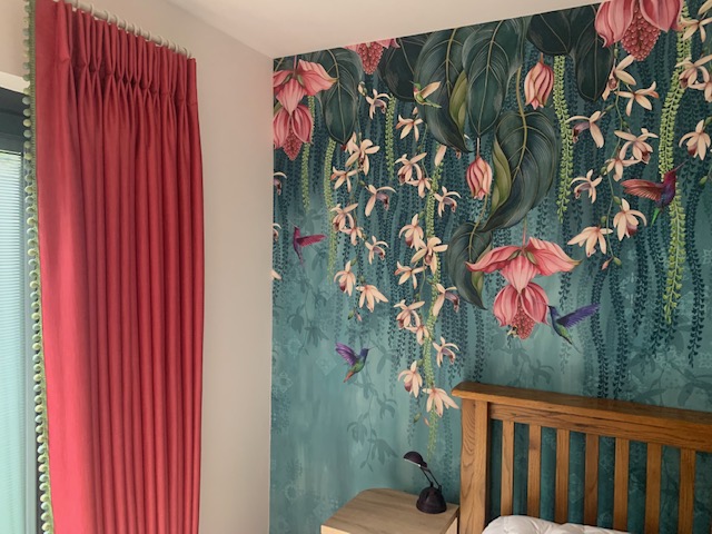
The vibrant colour also highlights an awareness of nature represented by lifestyle trends where we’re bringing more living things into our homes with plants, florals and living walls. As we try to balance our digital and physical lives, we continue to appreciation the natural world and are finding new enjoyment in travel, sports, and outdoor recreation after having to pause these activities during the pandemic.
How can I use Viva Magenta in my home?
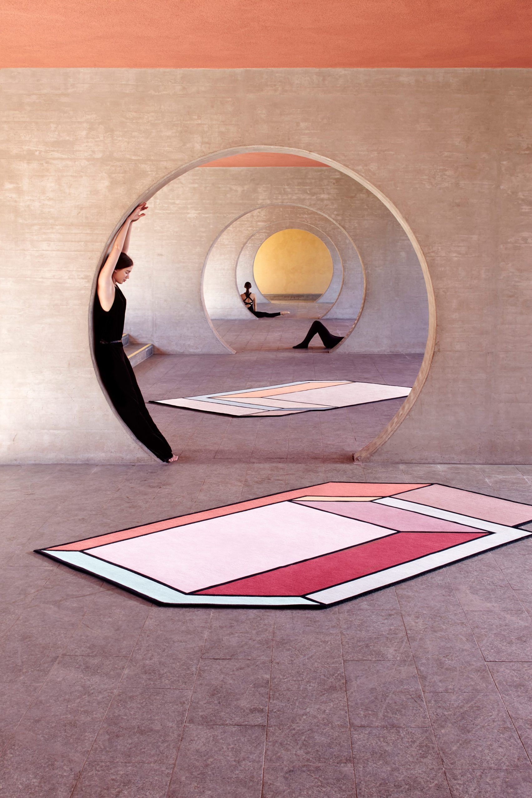
Viva Magenta is both powerful and empowering and can not only enliven a space but also add a touch of glamour to your home. It pairs especially well with greens and golds giving spaces a tropical charm, and whether you use it in wallpaper or furnishings, it will definitely make a statement. In your living room, it can be added in the form of cushions or throws or try wallpaper with a hint of Viva Magenta to accentuate the space. If you are really brave you could even introduce it as a carpet or in combination with other colours to create a balanced look.
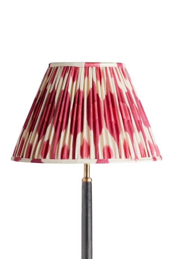
When it comes to curtains and blinds, it is a stunning colour to play with, but if you prefer a more subtle, understated addition of the colour, you could use it in your kitchen and dining areas in the form of table runners, table mats and crockery. Introduce the colour into your bedroom on your headboards or in your duvet cover or pillows or by adding abstract artwork on the walls.
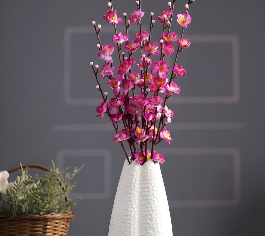
Although Viva Magenta is less aggressive than red, if you prefer a more neutral home, just simply use Viva Magenta as a pop of colour in a floral arrangement, vase or piece of artwork to add a touch of opulence. The shade can also be paired with white or cream to achieve an aesthetic balance, as if you go all out with this colour, especially in a small place it could make the space look cramped. In a larger space, try pairing it with blue to create a jewel-like tone.
You can also use black, browns, and greys to create a dramatic effect by highlighting the magenta and for those who appreciate the 1920s and 30s Art Décor era, Viva Magenta is a great colour to use. This period was famous for art deco architecture and characterised by strong colours and precise geometric shapes in design. Red, blue, orange, and purple also go great with viva magenta, especially in art deco styles with dark corners.
However, you feel you want to use Viva Magenta in your home, don’t be scared as interior design is all about experimenting and being brave with your design choices. We only live once and as the description for the Pantone colour of 2023 says, ‘Be vibrant, as it is an animated red that revels in pure joy, encouraging experimentation and self-expression without restraint.’
If you need any help or advice on using Viva Magenta in your home or would like Alle Interiors to redesign a room in your home or the overall style and feel of your home interior, please do get in touch. Also please check out www.alle-interiors.co.uk to view our products and collections and the services we offer.
Notes: –
Alle Interiors is a small creative team providing a one-stop-shop for all your interior design and soft furnishing requirements with customer service their utmost priority.
Photo credits:
Alle Interiors; Pantone; Pooky; Patricia Urquiola;
Suite VT80, iCentre, Howard Way, Newport Pagnell MK16 9PY
Tel: +44 (0)1908 299 358
Mob: 07712 150 721
Email: alle@alle-interiors.co.uk
