When it comes to decorating a room in our home; it can sometimes prove daunting as to what colour scheme to choose. Whether you are decorating the living room, kitchen, bathroom or a bedroom; everyone has their own individual tastes, ideas and style. However, it can sometimes be tricky to find colour inspiration for your home that provides just the right ambience and mood you want to set for that particular room.
Colour can be added to a room not just through painting the walls; but also, through the fabrics, wallpapers and of course the all-important accessories that you select. A room could be painted plain white on the walls but be brought to life through the fabric and texture of a sofa, wallpaper on a feature wall/fireplace and by the clever use of accessories including cushions, throws, vases and photo frames.
But can the use of colour in our homes affect our moods, behaviours and even our decisions and if so, what is the best colour to choose? This is where Colour Psychology comes in as it looks at how different colours can affect us and perk our mood up. The colours around us have a big impact every day from putting on a bright jumper in the morning to displaying a vase of beautiful coloured flowers in our home. We all have specific colours that suit our particular skin tone or hair colour and the same goes for our homes; certain colours help with our moods, how we behave and the decisions we make. So, just what do the different colour schemes mean?
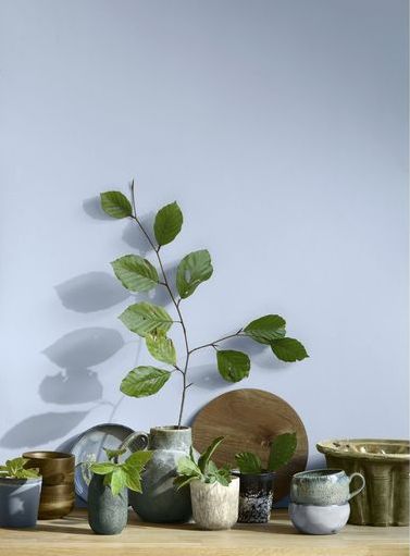
Green – this colour has lots of positive associations including nature, energy, wealth and luck and is also an appreciation of the natural world. It never really goes out of style and is a very calming colour.
Blue – this colour is often linked to sadness but it doesn’t have to make you feel blue as it can also bring calm and tranquillity to your home. It just comes down to personal preference whether you prefer bright or calming blues in your home interior schemes.
Yellow – this is the colour that is associated with feeling happy and optimistic, from the sun to bright spring or summer flowers. Yellow is also said to stimulate and increase our mental activity so, can add vibrancy and invigorate our senses in any room.
Pink – this warm and friendly shade can add a touch of romance to your room and has so many different shades to choose from. Blush pink is currently proving very popular and can be contrasted with grey and navy.
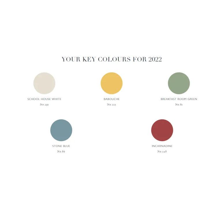
If you are still unsure of what would suit the room you would like to paint; and need some help; these are the colour trends for 2022 according to Joa Studholme – Farrow & Ball Colour Curator.
“There is something inherently human in the colours that we are attracted to for 2022, as well as in the way we use them,” says Joa, “Décor is moving forward while drawing inspiration from the modest character of the world of folk and craft, using five significant shades that extol the virtues of a simple life and can be used in any combination and in any room.”
The 5 Key Colours for 2022
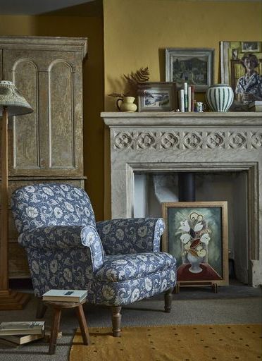
Babouche – the sunny yellow
This shade of yellow can be described as ‘subdued sunshine’ but is not overly bright or overpowering which makes it perfect for a larger room. It can help to brighten a space with limited natural light and would sit well with a pale blue or a soft pink/red.
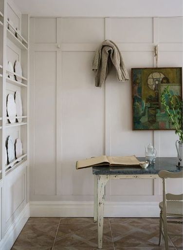
School House White – the updated neutral
A soft, off-white shade, ’School House White’ is designed to look like white in a shaded area. This timeless classic would pair easily with virtually any other colour and is ideal for a background on which to feature dramatic artworks or vibrant, statement rugs. It’s very hard to go wrong with this particular shade of white as it works well in all homes.
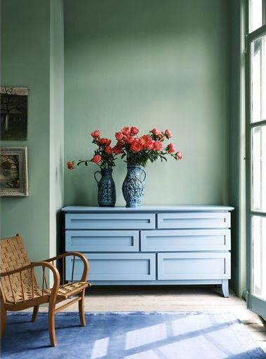
Breakfast Room Green – the cheerful shade
This is definitely the most cheerful of Farrow & Ball’s greens and reflects the natural world we retreated to during the first lockdown in our gardens and in the park. The shade complements plants and promotes a sense of wellbeing due to its calming nature. It also looks great alongside the Stone Blue shade.
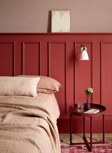
Incarnadine – the comforting red
This shade combines traditional red with the spirit of the Mediterranean and pairs perfectly with warm woodwork and rustic gold touches. Alternatively, you could pair it with a bright white shade or combine it with a monochromatic palette.
Stone Blue – the vintage tone
Vintage style is still as popular in 2022 and this warm and timeless blue can be used alongside other warm hues to create an inviting, vintage look. Alternatively, decorate with a cooler tone for a cleaner, more contemporary feel.
We hope this has helped with some ideas on what colours to choose; but remember your home needs to work for you and make you feel safe and cosy whilst being inviting to visitors. Trust your intuition with colour and try taking some risks. You could go bold and use tonal shades of colours or you keep it more subtle with some cushions and accessories in your chosen colour. As long as you choose colours that make you feel happy and put a smile on your face, there is no such thing as a bad choice of colour.
If you would like some advice on how to dress a room; from paint and wallpaper through to soft furnishings, cushions and accessories; this is where Alle Interiors can really help you make your house feel like a home. Please go to www.alle-interiors.co.uk to check out our products and collections and the services we offer.
Notes: –
Alle Interiors is a small creative team providing a one-stop-shop for all your interior design and soft furnishing requirements with customer service their utmost priority.
Photographs credited to Farrow & Ball, Country Living, and Linwood
Suite VT80, iCentre, Howard Way, Newport Pagnell MK16 9PY
Tel: +44 (0)1908 299 358
Mob: 07712 150 721
Email: alle@alle-interiors.co.uk
